Brand Guidelines
The Stella Maris Logo
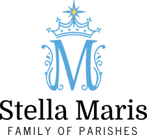
You’ll be seeing this around the four churches — the new Stella Maris logo. The logo features the title of our Family of Parishes rather prominently. It’s a “leave no doubt” sort of thing that appears in the Domine serif typeface from Google. The name Stella Maris is flanked by the identifier “Family of Parishes” in the News Cycle sans serif typeface — an apt descriptor of our current state within the Beacon of Light process. The combination of the serif font with the sans serif offers a clean look that is both classy and fresh.
The Marian “M” is the most prominent feature of our logo. The University of Dayton’s All about Mary series notes that “The letter M, and variants thereof, have commonly been used as Marian symbol. Some of the variants are M, MR, MAR, MRI.” You’ll also see VM as well. Monograms have long been part of the Catholic fabric, a short form, iconic representation of a word, title, or name loaded with meaning. You might think of the IHS “Christogram” — the first three letters of Jesus’ name in Greek (then transposed into Latin).
Mary’s monogram reaches deep into the cultural heritage of Catholicism, so we designed, stylized, and crowned our own version. Our Stella Maris M seems to be alive, like branches on a living vine (cf. Jn. 15:5). The crown, signifying the coronation of Mary and her being situated as the queen-mother of heaven and earth, features four stars representing the four parishes that comprise the Family. The logo reaches its climax in the star situated at the uppermost limit of the crown — an obvious nod to the title Stella Maris and a reminder that the whole Beacons of Light process is about situating the parishes of the Archdiocese to reflect the light of the living God in our present culture. It is worth recalling Pope Benedict XVI’s line that is the inspiration behind the name of the pastoral planning: “The parish is a beacon that radiates the light of the faith and thus responds to the deepest and truest desires of the human heart, giving meaning and hope to the lives of individuals and families.” One should also note that the star has eight points, signifying the 8th day of creation. Thought there were only seven days in Genesis 1? True. “But for us a new day has dawned: the day of Christ's Resurrection. The seventh day completes the first creation. The eighth day begins the new creation.” (CCC 349). Christ’s Resurrection marks the 8th day, the first day of the new creation — a reminder of the life we are to live.
The colors of the logo are straightforward. The typeface appears in black — they are bold and classy. The M monogram embraces a traditional Marian blue. Blue is the color of the sky, thus, it is a heavenly color. It is also the color of the people of Israel (see Numbers 15:38-39), of those who follow the Lord’s commands and do his will. Mary, part of this people, is the one who carries out the Lord’s command with her perfect fiat, “let it be done unto me according to thy word.” Finally, the golden star atop the crown — this signifies both royalty and light. Mary is queen and she is also a beacon of light. She is an apt model for us as we traverse the new pastoral landscape created by Beacons.
Colors
RGB (26, 53, 87)
HEX #1A3456
RGB (232, 56, 72)
HEX #E73747
RGB (86, 168, 221)
HEX #56A7DC
RGB (244, 249, 239)
HEX #F3F8Ef
Logos
Primary Logo


